|
|
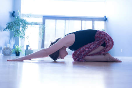
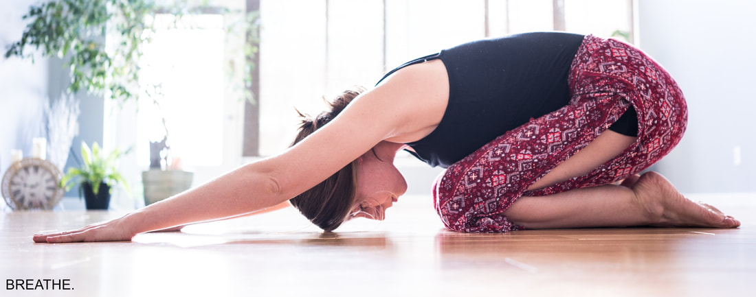
DESIGN THOUGHTS:
- This photo was crooked to begin with and I wanted to straighten that out.
- It was also a little blue, so I wanted to make sure to correct it.
- I wanted the photo to be simple, as well as the caption, because of what is being advertised.
- I increased the exposure.
- I also increased the brightness of the whites.
- I made the photo a little more crisp by increasing the contrast and exposure as well.
- I cropped the photo to focus the audience's attention on the girl, rather than on the window.
- I also warmed up the photo a bit.
