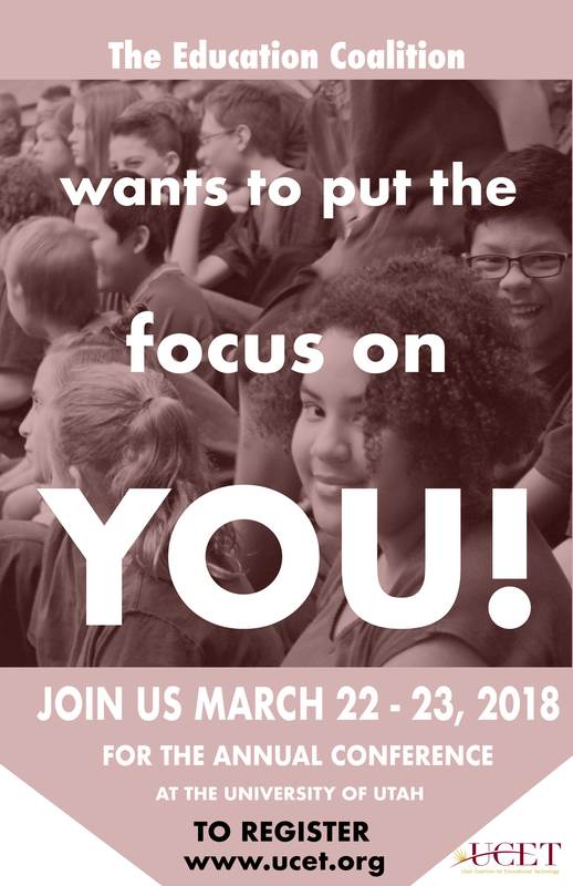
DESIGN THOUGHTS
- I used Futura font in capital letters with all of the lettering, except for the online registration address.
- I used different font sizes to emphasize a certain message.
- I used different font colors in order to easily distinguish one message from another.
- I included a candid, authentic photo to make the poster more relatable.
- I kept proximity in mind while creating this look.
- I changed the fill opacity.
- I included the company logo in the bottom corner.
- I made sure the fill was covering the photo, in order to make the lettering stand out more.
- I changed the image to black and white.
