|
|
DESIGN THOUGHTS
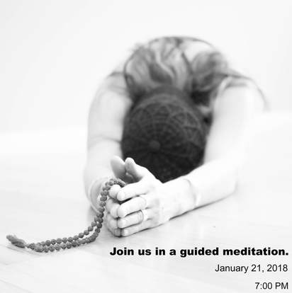
- I cropped this photo even more than what is being shown in the before. I wanted the focus to be on my subject without distraction for much else.
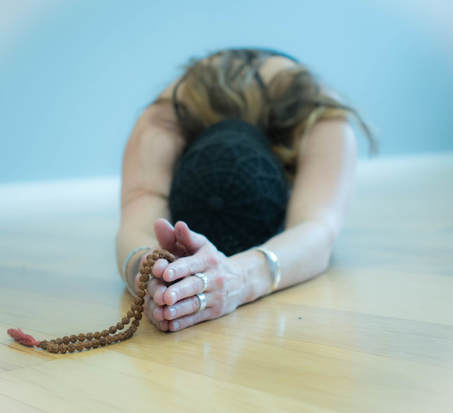
- When I took this photo, I had the subject sit with her back to the wall in hopes that I'd be able to increase my exposure enough to overexpose the background without disrupting the subject too much.
- I kept the font aligned with the right side of the graphic.
- I increased my exposure significantly to be rid of the blue wall and yellow wood floors.
- I chose a simple font size, and bolded the invite to draw attention to it. I kept the font small because I didn't want to distract from the image.
- I changed my levels and increased my contrast.
